What Arbitron and Nielsen radio ratings mean, in one line: they are industry estimates of how many people tune to each station and for how long, produced from a panel of a few thousand households rather than a count of actual listeners. Arbitron ran US radio measurement for decades until Nielsen bought it in 2013 and rebranded it Nielsen Audio. Every number in a ratings report, from share to cume to average quarter hour, is a weighted projection from that sample, with a margin of error attached.
That last part is where most people get it wrong. A share of 6.0 is not a headcount, it is a slice of an estimated pie, and the size of that pie can change dramatically without the slice moving at all. The rest of this guide unpacks each term, shows how the estimate is built, and gives you a method for reading a report without over-reading it.
Table of Contents
- What Arbitron and Nielsen Radio Ratings Mean
- How Does a Radio Ratings Panel Estimate Listening?
- What Do Average Quarter-Hour, Reach, and Cume Mean?
- How Are Radio Ratings and Market Share Calculated?
- What Do Ratings Mean for Music Programming?
- Why Does the Measurement System Change When Listeners Stream?
- What Are the Limits and Errors of Radio Ratings?
- How to Read a Ratings Report Without Being Misled
- Frequently Asked Questions
- Is Arbitron the same company as Nielsen?
- Are radio ratings an exact count of listeners?
- What is the difference between radio reach and average quarter-hour?
- Does a higher ratings rank always mean a station is more popular?
- Can terrestrial radio ratings be compared directly with streaming numbers?
- How accurate are Nielsen radio ratings in small markets?
- Conclusion
What Arbitron and Nielsen Radio Ratings Mean
Arbitron was the original US radio ratings currency, the company broadcasters and advertisers trusted for station-level audience estimates. Nielsen bought the business, with the FTC clearing the deal in September 2013, and the service was renamed Nielsen Audio.
Both names describe the same currency. If you see a station’s historical chart labelled Arbitron and today’s number labelled Nielsen, they are measuring the same behavior with a different instrument, which is exactly why the two eras are not always comparable.
Here is the short version of the terms you will meet in any report.
| Term | What it measures | In plain English |
|---|---|---|
| Rating | Average quarter-hour audience as a percentage of the market population aged 12 and over | Out of everyone in the market, what share were tuned in during an average quarter hour |
| Share | A station’s slice of the total listening audience | Of the people who were listening to radio at all, what fraction picked this station |
| Cume | Cumulative audience, the count of distinct people who tuned in at least once in a period | Total reach, counted once per person, no matter how long they stayed |
| AQH | Average quarter hour, the average number of people listening during a typical 15-minute slot | The size of the audience right now, on a normal day |
| TSL | Time spent listening, the average time each person spends with a station | How long a listener stays once they arrive |
| PUR | Persons Using Radio, the share of the population using radio at all in a day | How many people take radio into their day in any form |
| SPI | Sample Performance Indicator, a reliability score for the panel | How well the sample behaved compared with the panel, out of 100 |
Two words in that table carry most of the confusion. Rating is measured against the whole population; share is measured against listeners only. That single difference explains why a station can hold its share steady while its audience shrinks.
How Does a Radio Ratings Panel Estimate Listening?
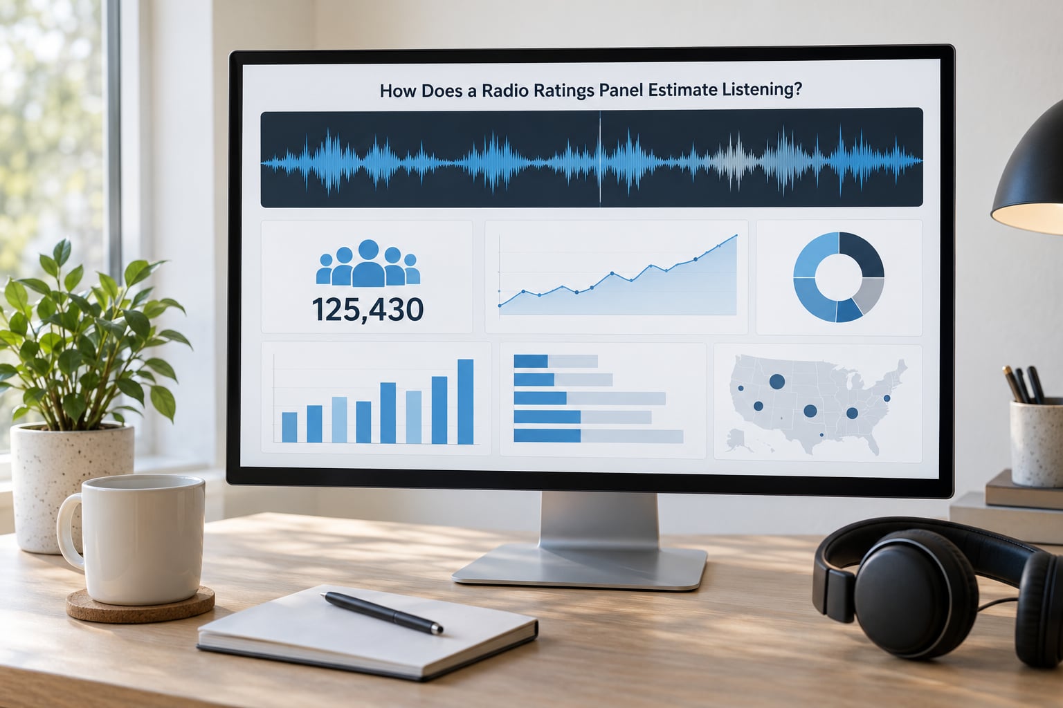
The estimate is built in five steps: recruit a panel, instrument it, collect a week of behaviour, weight it, then scale it up to the market.
1. Recruit. Households are selected through address-based sampling, so the panel is drawn from the same population distribution the market report describes. This stage is where non-response bias creeps in, and it is the part broadcasters argue about most.
2. Instrument. In larger markets, panelists wear a Portable People Meter, a small device that detects inaudible codes embedded in station audio. In smaller markets, and for specific demo slices, the panel fills in a diary instead.
3. Collect. The panel reports a week of behaviour. For diary households that means writing down what they heard and when, which is slow, and for meter households it means carrying the meter everywhere, including out of the house.
4. Weight. Raw panel behaviour is adjusted to match the market on age, sex, race, geography and other demographics. A panel that skews toward heavy listeners will flatter every station in it, and one that skews toward light listeners will punish them.
5. Project. The weighted panel results are scaled to the full estimated population of the market, producing the published rating, share, cume and TSL figures.
The two instruments are not interchangeable, and broadcasters know it. A meter counts exact minutes and cannot tell whether away-from-home listening happened in a car or at a desk, because it only knows whether the meter is on its home charger. A diary captures location and activity far better but relies on memory and rounding.
Both are getting supplemented. Nielsen’s mSurvey mobile diary, referenced for the Spring 2026 survey, replaces paper diaries for selected households with phone-based self-report. It is not automatic detection like a meter, and a self-entry diary inherits the same rounding habits as paper.
What Do Average Quarter-Hour, Reach, and Cume Mean?
Average quarter hour answers how many people are listening right now; reach and cume answer how many people touched the station at all across a longer period.
The AQH figure depends on a credit threshold that most listeners have never heard. A person must be tuned in long enough within a 15-minute window to earn credit for the full quarter hour, and that threshold has changed. It was five minutes under the long-running diary standard, and Nielsen has moved to three minutes for terrestrial radio, with streaming and podcasts treated separately. The change was significant because Nielsen reported that nearly half of listening occasions fall short of the old five-minute bar, so lowering it moved a large volume of occasional listening into the counted numbers.
Reach and cume behave completely differently from AQH, and the gap between them is where the most interesting story in modern radio sits.
| Metric | Period | Question it answers | Common misread |
|---|---|---|---|
| AQH | An average 15-minute slot | How many people are listening at any moment | Read as the station’s total audience |
| Cume | A day, week, month or survey | How many different people tuned in at least once | Read as average audience |
| Exclusive cume | Same | How many heard only this station in the period | Assumed to equal total cume |
| TSL | A day or average day | How long each listener stays | Read as a percentage |
| PUR | A day | What share of the population uses radio at all | Confused with share |
Radio’s reach and its time have pulled apart. A RadioDiscussions moderator put it plainly: nearly as many people use radio today as they did 20 years ago, but they just spend less time with it because of all the alternatives. Cume has drifted down roughly 10% while average time has fallen far harder, so a station can look healthy on reach and hollow out on AQH.
How Are Radio Ratings and Market Share Calculated?
Rating divides the estimated AQH audience by the market’s population of people aged 12 and over. Share divides the same estimated audience by the total estimated radio audience, which is why every share in a market adds up to 100.
That is the whole trick. Share is relative, so it can only describe a fight between stations, never the size of the crowd. As one RadioDiscussions moderator put it, share will always add up to 100, no matter how few listeners there are. A station can hold a 6.0 share for years while its absolute audience falls by two-thirds, because everyone else fell too.
A line from a typical market report looks like this:
| Station | Share | Rating | Cume | TSL |
|---|---|---|---|---|
| Station A | 6.0 | 2.4 | 38.2% | 41 min |
Read it in order. A 6.0 share means Station A took one listener in seventeen. A 2.4 rating means that listener group is 2.4% of everyone aged 12 and over in the market. A 38.2% cume means roughly 38 people in every 100 in the market heard the station at some point during the period, counted once each. A 41-minute TSL means the average person who arrived stayed for 41 minutes.
All four numbers describe the same station, and they are not interchangeable. Reach without time is a very different business from time without reach.
Ratings turn into money through ad pricing rather than payment to listeners. Advertisers buy GRPs, gross rating points, which are reach times frequency, and stations quote a CPP, cost per point, or CPM. A lower share point today buys far less real audience than it did in the 1990s, so the rate card and the ratings have to be read together, never apart.
What Do Ratings Mean for Music Programming?
For a music station, ratings decide scheduling and rotation more than they decide anything else, because ratings decide which dayparts an advertiser will pay a premium for.
Dayparts drive everything. Drive time and morning shows carry the largest audiences, so they carry the largest rate cards, and a program that underperforms in drive time is a commercial problem before it is a creative one. Demonstrations narrow the picture further, with A25-54 and 18-34 slices reported separately because that is how national advertisers specify their buys.
Share matters more than rating in music radio, because format competition is a zero-sum fight. A classic rock station at a 6.0 share is doing well even if its absolute rating is small, because those listeners are more likely to be a rock audience that an advertiser wants. Audience flow between stations tells a similar story, and shared listening is common, so cume figures across several outlets routinely add up to more than the market population.
What ratings do not measure is whether the programming is good. A station can hold a strong share with tired playlist rotation, and a great show can post a weak AQH in a small daypart. Anyone using a rating as a quality verdict is reading the wrong column.
Why Does the Measurement System Change When Listeners Stream?
Radio ratings cover over-the-air listening by terrestrial stations. Most on-demand audio, podcasts, satellite radio and music streaming are handled outside that system, so a station’s number does not include them.
The reason is structural. A meter or diary can detect a signal from a broadcast transmitter because that signal can carry an encoded identifier. A stream on a phone app is delivered to a device that no in-home meter is watching, and in many cases the listening happens away from the panelist’s home entirely, with headphones and screens that the instrument never sees. Publishers and platforms report their own plays, using their own definitions of a valid listen, and those figures are not audited by the ratings panel.
Comparing a broadcast rating to a platform’s reported plays directly is like comparing a survey estimate to a counter. Both can be useful, but they measure different universes and different definitions of a listen, so the comparison only works if you hold the period, the geography and the definition steady on both sides.
If you are reading a UK station’s numbers, the equivalents are RAJAR, the Radio Joint Audience Research panel, and RSGB, its successor, rather than the US system described here.
What Are the Limits and Errors of Radio Ratings?
The numbers are estimates, and the error bars are wider than most public discussion admits. Here are the ones that actually move a number.
Sampling error. A market panel is a few thousand households, not the whole population. The smaller the panel, the wider the confidence interval, which is why small-market figures swing on tiny changes and why a week-to-week move rarely means much.
Non-response bias. Recruiting panelists is getting harder, and a panel filled by people who agree to take part is not automatically a neutral cross-section. Nielsen’s own two-stage rate, the questionnaire response rate multiplied by the Metro Unified Response Rate, has fallen to a small fraction of a percent. Industry analysts such as Barrett Media treat that as a material threat to estimate quality, not a footnote.
The methodology shift. This is the biggest one. The introduction of the Portable People Meter in 2008 and 2009 reduced Persons Using Radio from the late-1990s figure of around 18% to 20% down to around 11% to 12%, according to a RadioDiscussions moderator who has tracked the series. The root cause was the diary itself, which overestimated listening time because most people rounded up to hours and half hours and seldom rounded down. So more than half of the apparent decline was a measurement change, not a change in behaviour. A 1990s Arbitron number and a current Nielsen number are not the same measurement, and comparing them without noting the switch tells you almost nothing.
The credit threshold. Moving from five minutes to three minutes for quarter-hour credit changes which listening occasions count at all, which is why the shift is reported as a headline rather than a footnote.
Reporting lag and partial data. Results arrive well after the survey period, and the public release is deliberately incomplete. Much of the detail, including in-tab daypart and demo splits, sits behind a subscription.
How to Read a Ratings Report Without Being Misled
Run through this checklist in order before you repeat any number to someone else.
1. Check the period. Confirm which survey wave or week the figures cover. Comparing a spring wave against a holiday wave is meaningless.
2. Check the market. Look for the market name and the population universe behind it. A rating is a percentage of that specific universe, so the same number means different things in differently sized markets.
3. Check the station universe. Confirm whether the market includes only full-power commercial stations or also translators, low-power stations and, depending on the report, noncommercial signals. Share depends entirely on who is being counted.
4. Check the sample and the reliability score. Look for the sample size and the SPI. A low SPI means the panel underperformed and the estimate carries more error than usual.
5. Check the daypart and demo. A full-day all-demo figure is not the same as a drive-time A25-54 number, and quoting the wrong one is the most common error in casual retellings.
6. Check which metric you are quoting. Decide whether you are talking about rating, share, cume or TSL, and say which one out loud. Most arguments about radio ratings are really arguments about which of the four was meant.
7. Check the source and the vintage. If the number is pre-2008, it came from a diary and is not comparable to modern meter data.
Frequently Asked Questions
Is Arbitron the same company as Nielsen?
No. Arbitron was an independent US radio ratings company until Nielsen acquired it, with the FTC clearing the deal in September 2013. The service was then rebranded as Nielsen Audio, so Arbitron and Nielsen are the same measurement business under two names, and older reports carry the Arbitron label.
Are radio ratings an exact count of listeners?
No. They are estimates projected from a panel of a few thousand households per market, weighted to match the local population and then scaled up. Sampling error, non-response bias and the choice of instrument all add uncertainty, so a reported rating of 2.4 describes an approximation with a margin of error, not a headcount.
What is the difference between radio reach and average quarter-hour?
Reach, published as cume, counts the distinct people who tuned in at least once across a period, counted once each. Average quarter hour counts how many people are listening in a typical 15-minute slot. Reach answers how many people ever came; AQH answers how many are there now.
Does a higher ratings rank always mean a station is more popular?
No. A rank or share is relative, so it describes standing against other stations rather than absolute size. Because share always sums to 100, every station can hold its share while total listening falls. Check the rating, the cume and the period alongside the rank before calling anything more popular.
Can terrestrial radio ratings be compared directly with streaming numbers?
Not directly. Broadcast ratings come from a panel instrument and cover over-the-air listening, while streaming and podcast figures are publisher-reported plays using each platform’s own definition of a valid listen. The two measure different universes, so a comparison only works if the period, geography and listen definition match on both sides.
How accurate are Nielsen radio ratings in small markets?
Less so, simply because the panel is smaller and the confidence interval is wider. A few thousand households spread across a large geographic area produce a noisier estimate, and small week-to-week moves carry little meaning. Nielsen also uses diary methods in many smaller markets, which brings back the rounding bias the meters were introduced to remove.
Conclusion
Arbitron and Nielsen radio ratings describe what an estimated audience did, not what every listener did, and the difference between the two is where almost every misreading starts. Before you repeat a figure, name the metric, the market and the period, and treat a share as a position in a contest rather than a measure of size.
If you want the honest state of a station, read the rating and the cume together, check the sample and the survey vintage, and remember that a pre-2008 diary number belongs to a different measurement era entirely.